How to pair a script font with a sans serif
A script and a clean sans are the classic pairing for invitations, menus, labels and posters. Five rules that make the two work together, with examples.
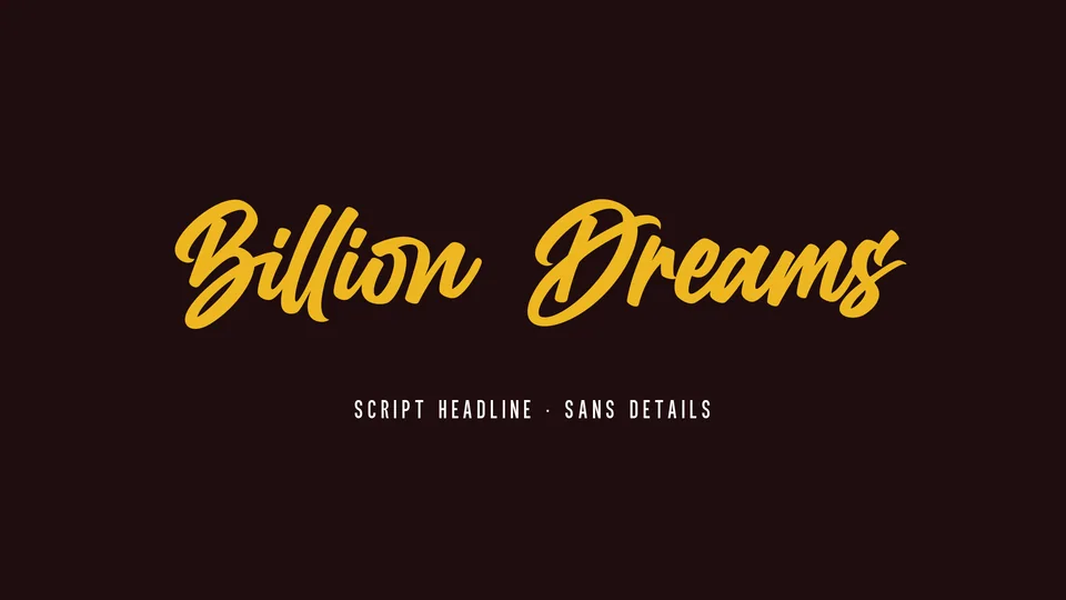
Few pairings are as dependable as a script headline over a sans serif. The script brings the character; the sans does the reading. It works on invitations and menus as well as on labels and posters, and it is hard to get badly wrong if you follow a few rules.
1. Give the script one job
A script is at its best on one to three words: a name, a title, a short phrase. Long sentences in a script tire the eye, and the swashes start to collide. Everything that has to be read, such as dates, addresses, prices and descriptions, goes in the sans.

2. Contrast, not competition
The two fonts should be clearly different. A flowing script sits well with a sans that has even strokes and simple shapes. A sans with strong quirks of its own starts to compete with the script, and neither gets the attention.
3. Size and spacing
Set the script clearly larger than the sans, often two to four times the size. When the sans is in capitals, give it extra letter-spacing: tight capitals look cramped next to a loose script.
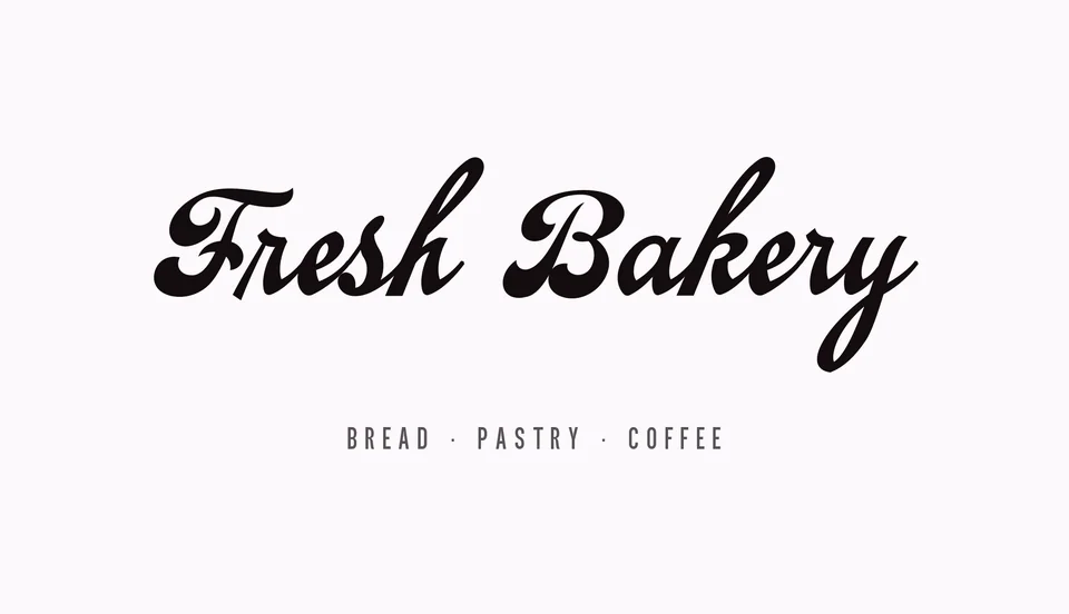
4. Never two scripts
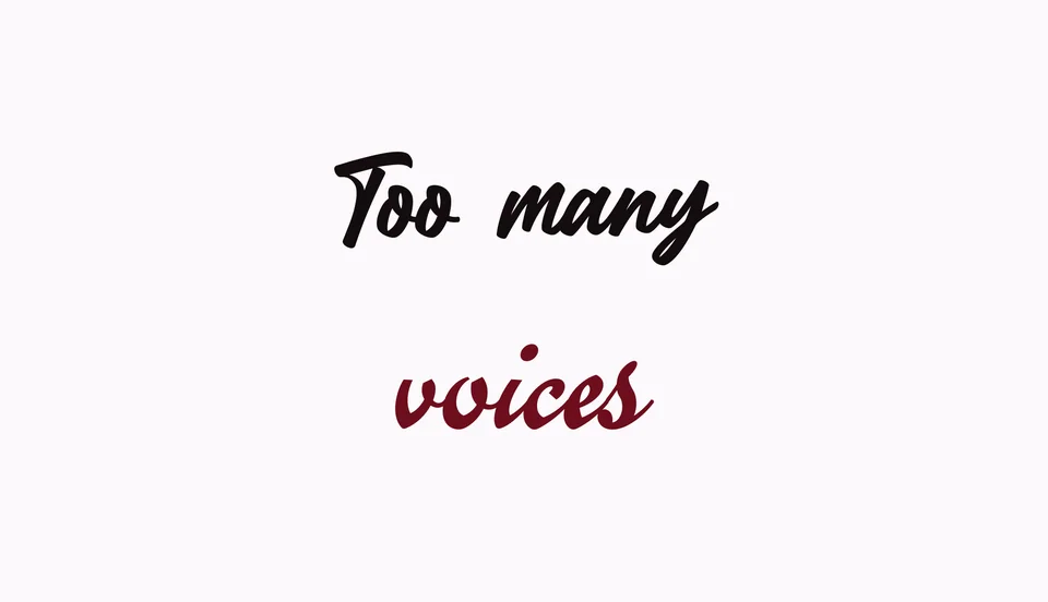
Two scripts on the same page fight for attention, even when each is beautiful on its own. If you need a second voice, use another weight of the sans, or an italic.
5. No script in all capitals
Script capitals are drawn to start a word, not to stand in a row. Set the script in upper and lowercase, and save the capitals for the sans.
Scripts to start with
 Billion DreamsFont · Script →
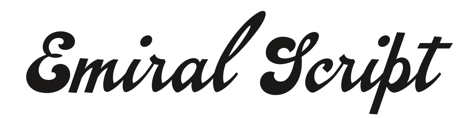 Emiral ScriptFont · Script →
Questions
How many fonts should one design use?
Usually two: a script for the headline and a sans for everything else. A third is rarely needed.
Can I pair a script with a serif instead?
Yes. The same rules apply: give the script the headline, and keep the serif calm and readable.