Custom Graphics
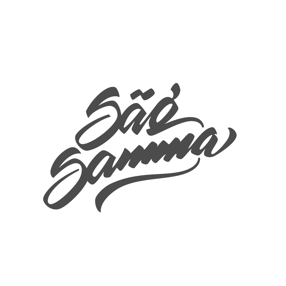
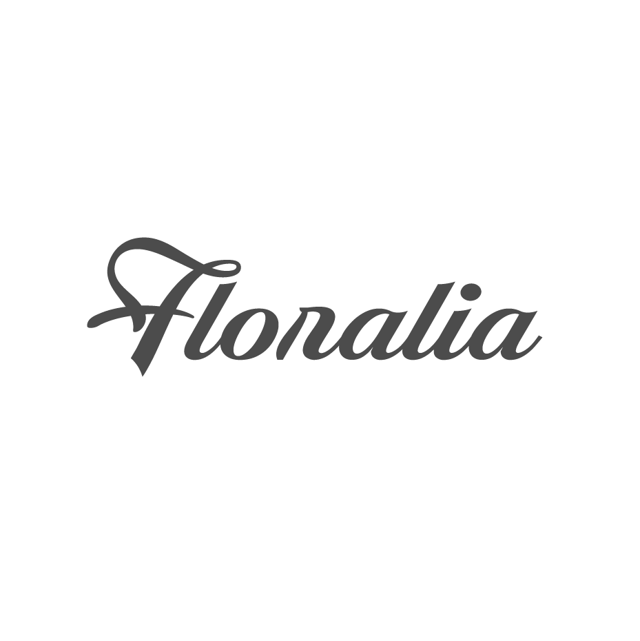
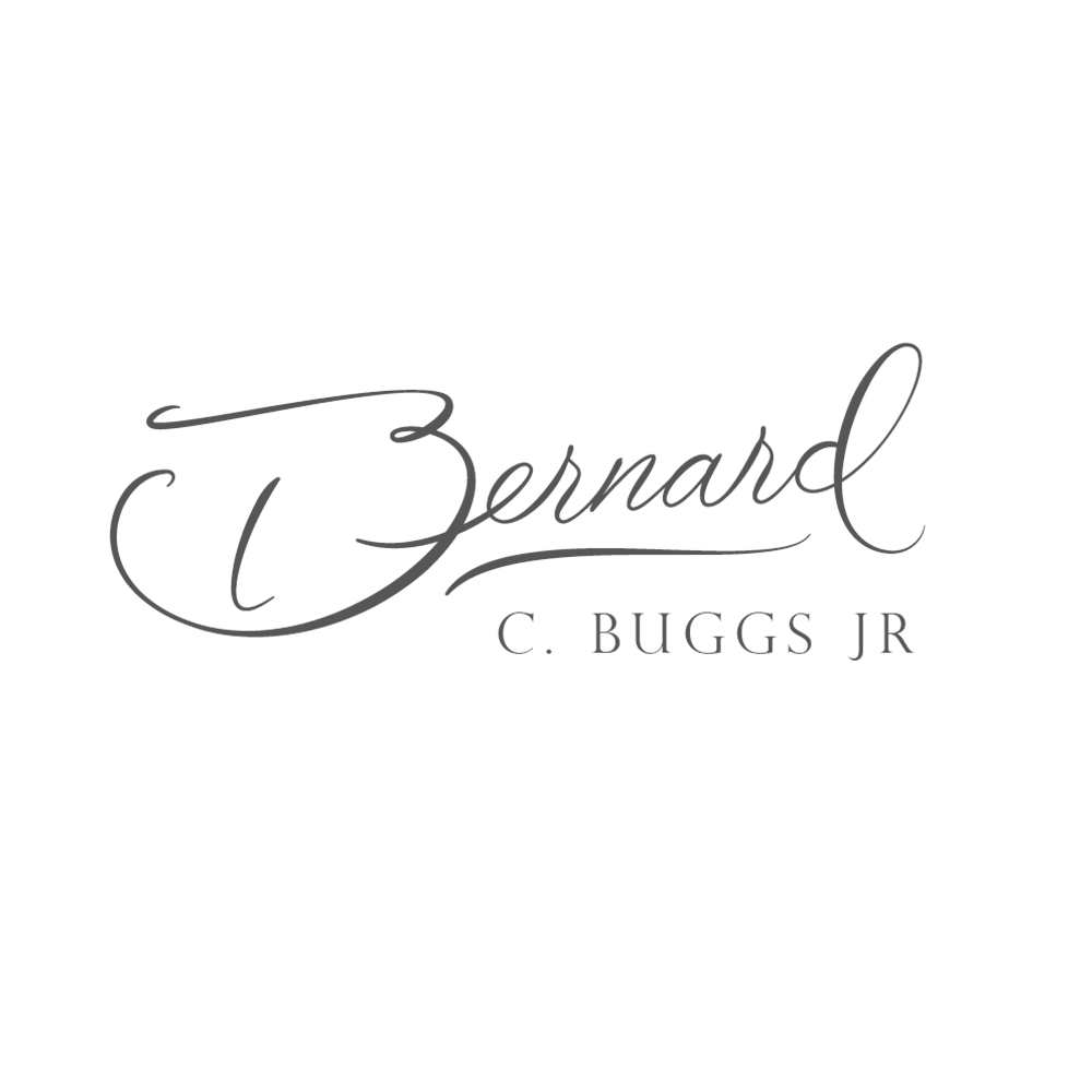
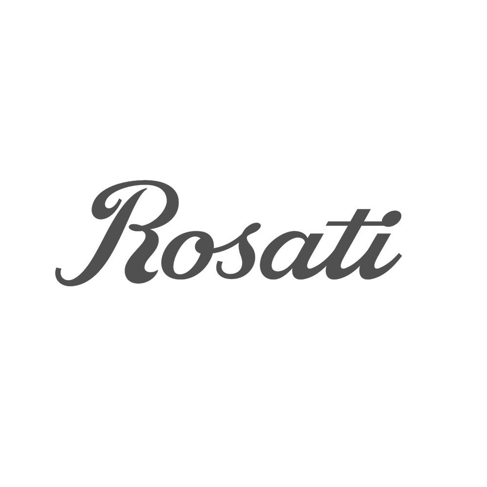
In addition to creating fonts, I design custom graphics such as logotypes.
Before reading this, please be aware of the difference between a logotype and a font.
Basically:
A logotype is a static image, for example the Coca-Cola logo.
A font is an installable software containing a set of letters, for example Times New Roman.
Pricing
I charge 150 EUR per effective working hour.
I only count actual effective work; i e do not charge anything for correspondence or administrative work.
I work in steps, and you will be part of the process minute-by-minute to steer the project in your desired direction.
I am working very efficiently, and have 10+ years experience of full-time professional work in lettering and logo creation, in addition to multiple years of work in graphics and design.
Because of this, you can get a professionally created logo including adjustments from less than 200 EUR, and my work rarely gets more expensive than 300 EUR.
Timeline
Send an email to contact@mansgreback.com and I am often available for work the same day.
I confirm my availability and after your go-ahead I start creating the logo.
I get back to you for feedback, usually several times per hour of effective work.
To guarantee maximal effectiveness, I keep track of every working minute and will be able to share this record with you.
Depending on the speed of your feedback, your logo can be finished within 24 hours.
What I need from you
A description of what you are looking for; words, colors*, design.
A hand-made or computer-made sketch.
Any other images that you might have.
Eventual budget or deadline.
I strongly recommend the sketch to keep the time down. It does not have to be aesthetically good, but a sketch of what you want makes the process much faster and with a more satisfactory result. It is also generally true that the more information I get from you, the faster and easier it will be to complete your logo.
* Regarding colors:
I usually suggest starting with black-and-white until the shape is complete, and then looking at colors as a second step.
This is because of several reasons:
— Even if you want the logo in color, in most cases you will need a black-and-white alternative for certain contexts;
— A good logo should in my opinion look good in black-and-white, and;
— It will keep the amount of work to a minimum. Rendering one logo in a couple of colors does not take any time, but rendering 20 versions of a logo in 20 different colors takes a lot of time.
What you will receive
Complete and exclusive ownership of the logotype or font.
Vector graphics in PDF, AI, EPS or any other format.
High quality images in PNG, JPG or any other format.
Font files in OTF, TTF or any other format.
